
The big question is “Does continuous cell phone use cause brain cancer?” The answer is still unclear due to limited research, but there are ways that I can track down the results from the studies done so far. After I gather my information, I’m going to be making an infographic, which is basically a visual image of gathered information, like a chart or diagram. By using this website, http://piktochart.com/blog/8-types-of-infographics-which-right-for-you/, I was able to figure out which infographic style I should use for my specific topic.
I think the best types of infographics for me to try out are graphs or a timeline showing the increase in cell phone use compared to the increase or decrease of brain cancer. I could also try using what is called a photo infographic, showing a picture of the brain and highlighting the places of the brain that brain cancer is most found.
example of Graph:

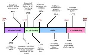
example of Timeline:
example of Photo Infographic:

For my specific topic, it might be helpful to use data on how many people have brain cancer, how many people get it per year, or see the ages of the cell phone users and like it to the ages of people with brain cancer. I think it would also be helpful to make a graph showing how many people prefer talking on the phone over texting and vice versa.
After coming up with the ideas I think would make up great infographics, I know I need to research a bit more of the facts and figures of these ideas. I have yet to find an article with a lot of data I could possible use for this.
Any thoughts or words of advice??

This is an awesome use of graphs to better formulate your argument, Go pokes.
LikeLike
Can’t wait to see it, I think it’ll turn out great!
LikeLike